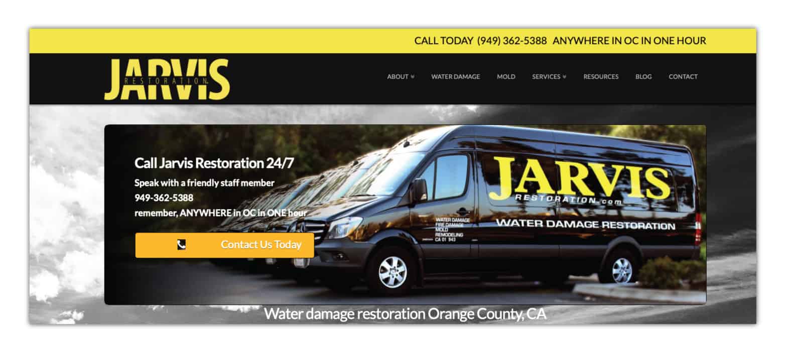
Before
The original website was cluttered and outdated.

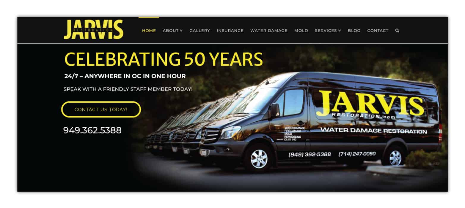
After
The new website is sleek and easy to read.

The Process
The original website was lacking hierarchy, resulting in bad eye flow. We corrected this by adding hierarchy in the text so the viewer could easily read the call outs. The original site also presented a cluttered feel due to the image in the background. By removing the image background, the viewer is no longer distracted and can properly interact with the call-to-actions. Even though we kept the same yellow and black colors for branding, we revamped how the colors were used to look more professional and to be easier on the eye.
How Does Your Website look?
Does your website have:
Good eye flow - When looking at your website, does your eye read top to bottom, left to right? Or does your eye bounce around all over the page with no resting points?
Hierarchy - Does your website use proper text sizing? Are your titles large enough a user can decipher them from the text? Or does all your page look like a long run-on sentence?
Professional use of color - Does color distract the viewer from properly interacting with your site? Or does the pop of color help direct the user to your call-to-action?
If you are concerned your website is suffering from any of the above issues, it may be time for an update. No need to build an entire website when you can give your current site a facelift. Call the team at We're Your Business (WYB) today to see how we can help (800) 595-7118. (Option 1 for Sales) or [email protected]


